Tuesday, 28 December 2010

Evaluation

Media Evaluation

1. In what way does your media product use, develop or challenge forms and conventions of real media industry?

Our magazine cover follows some the conventions any professional magazine would. It has a left and right-hand third on our magazine, we have a colour scheme of black, white, pale blue and a pale red-orange, ‘Popcorn’ is targeted at a young teenage audience the same as the film that’s why we used pale blue and pale red as they are softer colours also they added colour to the magazine and our actress brightened it up. The main image on the magazine cover is of Saroj dressed in a sparkly dress which we think will stand out on the shelf and it will attract the attention of the views and entice our target audience in to buying theproduct. I followed the standard convention of the magazine because I know that those convention and techniques work well within the market. Big companies like Bauer and IPC use and follow them on their most successful magazine covers and make massive profits from there sales every year also to follow the conventions there is a lot of main stream magazine that I can getinspiration from.

The main image on the poster is a heart shaped montage of pictures of the two leading characters doing different poses or actions. All of the images are an orange colour they have been manipulated so that the orange tones are increased. This symbolises the warmth and love in the trailer also it fits well with the pale pink edge of the heart boarder on the poster which is there to also symbolise the warmth and love on the poster. The billing block is at the bottom of the poster the title doesn’t follow conventions and is not at the top of the page but it’s in the middle slightly off centre. We did this because we wanted the heart to be as big as we could get it and we put it just off centre so it didn’t cover the images to much but we wanted it to be noticeable so we put the star callout behind to be eye catching.

Originally we wanted our trailer to be a trailer for a romantic comedy but we established that writing comedy is very hard because one person’s humour is not the same everyone else’s therefore it makes it hard to make everyone laugh, so we had to change our trailer from a Romantic Comedy to a romantic film. We followed the conventions of continuity editing when editing our trailer, we tried to film in a professional manner and follow the basic rules like the 180° rule.In addition to this because it’s a romantic trailer we tried to use as few straight cuts as possible because straight cuts are very disjointed and they stop the flow and momentum of the trailer which is great if the trailer genre is a thriller or horror when you want your audience to jump and keep them on the edge of there seats but romance is never straight forward and as clean cut as a straight cut.We wanted to show the fluency of the narrative, of the couple growing towards each other and the progression of their relationship throughout the trailer, we found that cross fades complement the momentum and they didn’t halt the progression as much as straight cuts. The narrative of our trailer breaks conventions in the sense that the typical stereotype teen romantic film/trailer would be the girl being the geek and the boy being the popular kid but, in our film/trailer we have Kevin playing the geek and Saroj playing the popular cool kid to breakconventions and fill the gap in the market of having the boy as the popular character and the girl as the ‘geek’.

The soundtrack for our trailer isn’t very complicated we have the dialogue and our theme music, our theme music is an original composition written for this trailer. The piece of music is called kisses and its all about that ‘unexpected kiss’ or that unexpected love interest like in our trailer, its sung by a female to correspond with the trailer that its unexpected by the girl to fall for the geeky boy. In the trailer the music goes into the middle 8 early because we wanted there to be a turning point in the trailer where the boy had been rejected and he felt like he didn’t have a friend in the world and then when the song comes out of the middle 8 we have the geeky boy and the cool girl getting together and a few shots of them holding hands.

2. How effective is the combination of your main product and ancillary texts?

Our poster we used photos of Saroj and Kevin in their costumes, we had Kevin wearing a pair of white converse knee high socks some almost skin tight three quarter length shorts and a t-shirt that had cartoon characters on it and in some shots a pair of glasses. For Saroj it was a little more glamorous we had her wear some of her own cloths that looked modern and current we did this because you cant get more current fashion than what teenagers are wearing today to go out and impress their friends. which they wore in our trailer on our poster to show the link and branding then for our poster we used a picture of just Saroj on her own and used that to show a feature story on Saroj we did this because not manymagazines chose to cover and feature teen romantic films as the big main feature its normally the lead actor/actress of that film that they feature so we decided to take that angle with the magazine cover.

On our poster’s billing block and in our trailer I put in the logos which I created to show company branding, logos are one of the main and best ways to create company branding of a companies products. To make it look professional, I took my inspiration for my first logo from the Paramount Pictures Logo, I found out what paramount stood for which is power and influence this is what inspired my name choice, I got the name of Influence Productions then I had to think of adomineering picture like the mountains in the Paramount Pictures logo so I chose the idea of a fist. I took a picture of my own fist I imported the picture intoPhotoshop I cut out my fist then used the artistic filters in Photoshop and put a cut out filter on my fist I brightened my fist and the out the text in around it and just colour matched the text to my figures. I chose my fist because a fist is powerful and influential and power and influences is the meaning of the word paramount so I picked a symbol that I thought would represent power. For my second logo my influence was the Warner Brother’s logo what I did is I took a picture of the Warner Brothers logo and I cut it out to create a layered Photoshop file I then took out the WB from the middle of the logo and put my initials MC in the middle then I straitened the top parts off so it is more of a shield also so it isn’t copyright infringement.


3. What have you learned from your audience feedback? What do your audience think about the final product?

I have learnt that the target audience liked our trailer they said it was 'funny' 'interesting' and 'it would make me want to go and see it' the group of 15 year old boys and girls rated our trailer highly all giving above a 7 out of 10. Please See Graph 1 Bellow. When looking back on the final products I was worried that not everyone would understand that it was a Romantic Comedy and they would just find it more of a comedy but the message must have presented itself the majority of teenagers that reviewed the trailer said it was a ‘Romcom’ closely followed by the thought that it was a Romantic film. Some of them thought it was a comedy so we must have presented the genre well. Please See Graph 2 Bellow. We also showed the group our magazine cover and film poster, when asked about our magazine cover they said 'the picture make it stand out' 'the colours are nice' and 'the girl is pretty' also we asked them to rate our magazine cover. Please See Graph 3 Bellow. When we asked them about our poster they said 'love the colours', 'the pictures are lovley' and 'the heart is so cute', again we asked them to rate our film poster. Please See Graph 4 Bellow.

The things I would improve on the trailer are minor tweaks that I would do if I had more time really nothing major I don’t think, I would rerecord and dub the majority of Kevin’s dialogue because some of it when it was recorded was clipping on the way in and some of it was just unusable, the only other improvements I would make would be to the title and the logos there is just a few tweaks that looking back on after rendering and burning to disc I have noticed I think it was just a case of looking at it with fresh eyes and taking the break from editing.


4. How did you use new media technologies in the construction and research, planning and evaluation stages?

This project was the first time I have used the cameras in our media suite so learning to use them was a challenge. There are different aspects of the camera that can be affected by the smallest things like the exposure of the shot if filming on locations and there isn’t artificial lighting. If you have to cut and the redo the scene when editing you can get conflicts with continuity regarding the natural light, for example if a cloud moves in the sky and blocks the light or if the clouds in the shot and then moves or if piecing two shot together the cloud my even disappear.

Setting the cameras up was fairly easy you just have to make sure if using a tripod that it is level and secure preparing the cameras to film takes a little bit more brain power because you have to thing about the white balance of what your filming, this is so when editing the colours are all right and the same as everything you film. In order for this to be the same what you have to do is hold a white bit of paper up where your filming then zoom right into it so all you can see is white then adjust the white balance so its as white as you can get it making sure its not gone to far either side of green and blue. After which, you change the expose which is how much light is going into the lens and you can amplify that in the camera to make it seem brighter and also you can gate it to make it darker again. The final thing from the visual side is just getting the camera in focus I recommended that the auto focus was turned off because it focuses on the thing moving in the shot not necessarily what you want it to focus on, so it was just a case of focusing the camera. Finally it is connecting and testing the sound devices, on some shots I used two tie clip radio mic which pick up directions sound so they are good if you want clear dialogue of just on or two people, we were restricted to a maximum of two radio mic at any given time because the cameras only have to XLR inputs on them, for some shots I used a boom arm with a condenser mic on the end of it which was set to hypercardioid mode because I wanted it to be more directional then the only thing left to do is to connect the headphones and balance out the sound levels so its not to loud or quiet.

On to editing this project was also the first time I used Adobe’s Premiere Pro software out of our group I took on role of editor because I felt most comfortable sitting in front of the Apple Mac and I have experience with using ProTools and audio editing software. I could see past all of the daunting boxes on the screen and I edited the first clips and found it great to use so I took on the role of editor while Kevin took on the role of producer. Kevin and I made our thoughts, storyboards and ideas into reality using the effects and tools in Premiere Pro. In the editing room I would take the tape from the camera and run the footage off the tape into Premiere Pro were I would create individual .mov files of each clip I would then sit down with Kevin and we would watch each clip and find the best clips out of all the ones shot then I would import them into the trailer premiere pro session then I would manipulate them into where I thought they should go.

As a team we had team meetings about our ideas and visions of the trailer in our heads, me and Kevin would sit in the editing room and Kevin would say what he liked and what he didn’t like and the other members of the group would come in and I would show them my visions and Kevin’s visions and we would have a discussion on what we thought worked best and why then I would edited the clips into how we had decided, for example I said that the clip with Saroj Jessica and Beth walking through the common room should have audio on it and Kevin didn’t think it should so I took the audio off it and showed it to the group then put the audio back on it and again presented it to the group and after looking at both clips Kevin, Dannielle and Abbie all agreed with me that having the audio works better and it adds a nice change to the clip.

Once I had I rough idea what clips were going where I used the video effect tools and the transitions to create the transitions between shot, also I used tools like speed and duration to create the slow motion shots and rather using the dip to black video transition I used the opacity to create the dips to black because I felt that you have more control on what you do because you select the key frames so you control the speed. Also in the editing I had to create all of the titles, for the first love title I had to create it in Photoshop then save it as a .png not a .psd so that I could place it on the title frame in Premiere Pro because the titles in Premiere Pro default to a black back round because there is nothing on the underneath of it so once I had the first love logo in I created a text box and I put the date in the title frame.

In additions to this I create the title sequence at the end using Adobe After Effects what I had to do was open up my logos again in Photoshop which is were I created them and save then as logos/.png file then import them into After Effects and the what I did every two seconds I set a key frame and changed angle of the object on the X axis by 25% each time until I got it to do a full rotation then I exported that sequence first and then created a new composition and put my second logo in there this time I changed the size of the image every to seconds then once it was full size I exported the sequence then imported that into my Premiere Pro session and then changed the speed of the logos so they flowed much faster I then used a cross fade so it looks like the influence production logo punches the Marcus Cameron production logo out of the way.

For the audio editing I used ProTools, I have been using ProTools for nearly 5 years so I am very familiar with it but this was the first time I used it to edit audio whist having the frames on a timeline so I could see were the music needed to be changed and cut also I used it to compress some of the dialogue. Along side ProTools and Premiere Pro I used Adobe sound booth to clean up some of the dialogue because in ProTools I didn’t have the plug-ins to do the clip removal also I used it purely for easy so I didn’t have to unlink the audio then export it our of premiere pro the import it into ProTools to then work on it to the export it then to re-import it and then link it back to the video clip so I just used Sound Booth because it will run along side premiere pro and it is just a case of clicking a button and you’ve got the audio out sorted and in again in no time at all. As I mentioned earlier, I edited the soundtrack to emphasise the meaning in the narrative.

I used blogspot.com for my research, planning and evaluation so I could access my work anywhere that has the internet also I used it so I could embed file trailers and pictures into my work, blogspot.com is a totally interactive service. In conclusion to this I feel that my editing skills have developed massively and this has allowed me to become much more creative in our narrative and a product which I am proud of.

Graphs

Graph 1


Graph 2

Graph 3

Graph 4


Friday, 10 December 2010


We put the logo which I created on the posters billing block becasue they arwe on the trailer and they are the logos of the produces of the trailer/film therfore we had to put them on for branding.

Monday, 6 December 2010

Monday, 15 November 2010

Editing

A heavy roll i play in the group is with the editing of the trailer i am in charge of the editing and kevin stills in the editing room and a direction and the production ideas and we all contribute to the direction of the pieces and the main ideas that we want to present during the editing we have hit a few snags, one the the biggest snags we had was when filming on location at school we had a member of p.e staff walk right through shot turn to the camera + crew and wave. this coursed us a bit of a head ace as we had took several takes of this shot but this was the only one were the zoom speed and timing matched up brilliantly fortunately we were able to salvage a take where the zoom was a lot faster and in post production using the tools in premiere we were able to slow it down. the main software we used for the video editing was Adobe's Premiere Pro from the CS3 collection and the main programs we used for the production and post production of the sound was Pro Tools 8.0 with the odd bit of cleaning up of sound in Adobe's Sound Booth.

Friday, 15 October 2010

Film Poster

Each member of the group had to create and come up with a design and idea for a film poster to go along side out film trailer after which we had to deiced on the one which we were going to use for our film campaign. we took a look at each poster produced and we made a preliminary decision after which we had a group of 10 15 year olds look and analysis our posters and then tell us which film they would see based on the poster and it was a close call between Abbies poster and Danielle's in the end we decided to use
Danielle's poster but Kevin had researched billing blocks and followed the correct structure so we just imported the billing block layer from kevins photoshop file into Danielle's photoshop file.


Magazine Cover

the same as with the poster each member of our group had to come up with and manufacture a design for a magazine cover on which our film was the featured story again we used the same process of selection as we did with the film poster by having a team discussion and selecting a preliminary cover we liked and then opening it up to the same 10 students that picked the poster following the same criteria one the ground of if you seen this magazine cover which would most make you want to see the film again it was out of Abbie's and Danielle's and this time the decision was make to use Abbie's.


Monday, 4 October 2010

New Campaign Into Romantic Films

Iv decided to do some more research into films and there campaigns as I feel our trailer is heading more in the direction of a Romantic film more than a Romantic Comedy so I have chosen Dear John because it’s a Romantic film which is close to our target audience but this is at the top end of out target audience bracket as it is aimed at adults and older teens where ad our initial research aimed at teens.


The trailers show so many different emotions that they both feel though the film sadness, happiness, hope, LOVE, anger, pressure and then hate break having to say goodbye. The trailer leaves it open at the end do they get together after he comes back from war or dose she find someone else, she says right at the end of the trailer a lot can happen if 12 months but tonight your hear with me. Dose she me that in 12 months you could have found someone else so lets just enjoy to night or in 12 months I may have found someone else or in 12 months you may be dead or dose she mean the last 12 months have been so hard but finally you are hear with me together at last it makes you think and drives you to want to see the film. In the trailer there are lots of two shots and shot reverse shot between them both the two shots show there unity through the good times and bad also to show there loving relationship.


This poster shows a couple how are very much so in love from the body language we can see that he wants to protect and love her and we see that she feels safe and protected in his arm, but from the background we see they feel isolated almost different and this makes there relationship stronger its just him and her. By having them on the beach in the grass it shows use how natural they are together and being with one another is just seconded nature. In the poster there is no harsh colours the only thing that stands out massively is the white title on his navy blue jacket. The billing block on the poster is really big but in a pail yellow so it dosen’t really stand out that much the plug is telling the view what the story is going to be like its says ‘from Nicholas Sparks, best-selling author of The Notebook’ so that anyone who has seen the Notebook and like it will look at this poster and say to themselves that must be good because I like The Notebook. Also it has a question for a tagline which makes you think about what the movie could be about especial as the title of the film is Dear John.


This magazine cover focuses on Channing Tatum and his apple to women the plug line is the ‘All-American Action Hero’. The image is a mid-shot and the have followed an American colour scheme with the red and blue writing with the white background. He shows good positive and confident body language in this photo also his costume presents a strong character as well because it’s a military uniform.


Friday, 1 October 2010

Team Meeting

As a team we have decided to change the plot of our trailer, we our now having Kevin playing the geek and Saroj playing the popular person this decision came from our first photo shoot and research into the film market. We found that there are only a handful of film that have the boy playing the geek and the girl playing the popular person and we decided it would be better for our film if we did it this way. This means that our plot changes slightly and that the names of our characters have now changed, Kevin is now going to be playing Timothy Smith and Saroj is still going to be playing Kate Devine. Also in this meeting we talked about filming times and schedules me and Kevin went and booked the arts technicians times we booked the cameras out and we booked a space on location to go and film a science experiment all to come together and film on the 5th October.

Friday, 24 September 2010

First Magazine Cover Draft

First Magazine Cover Draft


I chose to use a pink background on my magazine cover because I am targeting my magazine cover at young females with our target audience age bracket, further more this is why I chose a pink masthead and a vibrant red to do the title of my film also I tried to create branding across my film poster and magazine cover by using the same font and colour. I followed the conventions of good magazine covers by having a left-hand third with information following the central image and story also I had the masthead at the top. Also in this image we are trying to portray that Saroj is the geek and Kevin is the popular kid through our use of costume and props by having Saroj carrying books and Kevin just standing there in his leather jacket waiting for the world to come to him. Form this in our team meeting we have decided to make Kevin into the geek and Saroj the popular kid. To do this we will change there costum and props. We have decided to do this after looking at the current market and that there is hardly any films showing the boy to be the geek and the girl to be the popular person. Finally I think I need to put more feature into my magazine and make it more attractive to our target audience I will do this by putting more stories in the left-hand third and by putting a few images of different stories which will also feature in my magazine.

First Draft Poster

First Draft Poster


This draft film poster is very basic and it just uses a few conventions of a film poster like a small billing block a date and a big title. I decided to use a plane white background with a symbolic heart which has no defined edges to make the poster look more romantic and dreamlike I also used the same colour and font for the masthead to create branding for our film. I used a similar image to the magazine cover to keep the branded and also to show that Saroj is the geek and Kevin the popular figure. The names of the staring actors are at the top of the page in a different font and colour so they stand out and are noticeable but with out taking over the cover and drawing your eyes to far away from the central image and masthead. Also I need to change the billing block and create my own logos because of copy-write laws.

First Images

We went to our school media suite to take our first images we wanted to go there because we have a green screen and we wanted to cut out the background and replace it with a better one or a solid colour.


When we got to the media suite and started taking our images we quickly learnt that taking and image on a green screen isn’t as easy as it looks. We quickly learnt about white balance as you can see from the photo above Kevin’s jacket is very yellow and so is the green also they were standing to close to the green screen creating shadow on the green screen whit in post production would have been a nightmare to colour replace.


Using our newly learnt skills we took the image above and found that using artificial light then changing the white balance and then playing with the exposure gave us the best image from this shot.


I then imported the image into Photoshop and started manipulating it using the colour replace tool and selecting all the different shades of green a got rid of the background then using the burn brush really finely I went in and put colour back into Kevin’s face.


After cutting out the background on the image I created a new Photoshop session and created the background above a used a big fades brush with a nice pink and free hand drew this heart.


Furthermore I placed the image that I cut out and manipulate earlier into the heart background the I created a title and used the texts effects on the layer to get the fine black border on the lettering the I used another text layer to put the leading characters names at the top of the poster, again a text layer to create the coming soon banner and the effects on that layer again to create the black border. Just a for my first draft I used logos of already established companies to make up my billing block.

Further Story Board

This is our further story board.


This is a further storyboard of our plot. In this it show the basic elements of our trailer and the different shots and locations we are looking to film in. for the first seen we where thinking of using fades to show the passing of time. In this storyboard the trailers doesn’t really have a denouement its just one scene after another we never find out the fate of our couple. The changes which we are going to make from this our very drastic we are now talking about having Kevin as the Geek and Saroj as the popular person, if we do decide to do this then I will have to do another story board and change the plot, I was going to change the plot anyway because every successful Romantic trailer has a cliff-hanger.

4th Meeting

In our team meeting we finalised our trailer plot, also we booked our arts technitions time to and a room in our science block on a morning when our whole groups free and our actors are free. now we are looking to write our transcript and a story board of the scene and shots, we also are having to use seperate ambient sounds from a different class room becasue our camera's only have to XLR inputs on the and we want both actors to have a tie clip mic.

Tuesday, 14 September 2010

Pictures Of Sources Used In Audience Research

These are the film magazine covers which we used in our audience research


These are the film posters we used for the audience research we did with the 15 years olds


Transcript For First Trailer

(Background noise)

Boy: Oh sorry! I didn't see ya.

Girl: (Picking up the same book) Thanks

Boy: So.. are you new here?

Girl: Ye, I've just started

Boy: Oh right, if you need anything, just give us a shout


We didnt really have a transcript for our first trailer and we told our actors the basic message we were trying to get across and they improvised, we learnt from this and in our future planing for further trailers we have decided we need a definative teranscript.

Monday, 13 September 2010

3rd Team Meeting

In our third team meeting we decided the names of our characters, Kevin Ward Will Play Danny Woods and Saroj Shoker will be playing Kate Devine. we a also decided the plot for our reworked trailer. and we final talked about our film name, at first we were going to call it Love Happens but quick;y found out that there was already a film called that so we are now looking at calling our film 'First Love'

Friday, 10 September 2010

First Story Board


This storyboard was our original storyboard with our initial ideas, this has now changed and we are not going to do the classic book drop in our trailer anymore and we are going to go down a different route. We have a few ideas like having them both at some sort of summer school and him being a completely different person away from school then she turns up in his school which puts a spanners in his works. This storyboard just shows some very basic plot ideas and some shots that we are thinking of using in our trailer.


Wednesday, 8 September 2010

First Trailer

First Trailer


First Trailer from Marcus on Vimeo.

Our first trailer is beyond basic we didn’t use any editing techniques our any editing software. We didn’t use any variations of shots or distances which made it uninteresting viewing. There is no dialogue in this trailer just very poor and distracting ambient noise. Overall the standard of this trailer was very poor there is no on screen text, no release date and no billing block.

Tuesday, 7 September 2010

2nd Meeting

In our second meeting we discussed ideas for our initial draft trailer. We decide we would have two character's walking towards each other, then bumping into each other the boy helping the girl pick her books up, they pick the same book up and lock eyes, after which they have a brief conversation and walk there separate ways.

Thursday, 26 August 2010

Market Analysis and Research Female's


After our group of five males aged 15 we took a group of five females aged 15 and asked them the same questions and recorded there answers which we have collated into the following graphs.
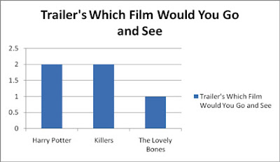
The Girls again like the Harry Potter trailer and The Killers trailer.


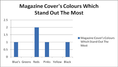
the girls picked out the reds the same as the boys but also the pinks.
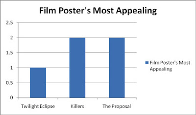
The girls found the Killers (romcom) and The Proposal (romcom) the most appealing film posters.
With magazine covers they said that red was the colour that stood out the most in the magazine covers but also they said the blue's, pinks and blacks stood out because they were the contrasting colours to the background
The girls like the Twilight saga posters and the Harry Potter posters the most.
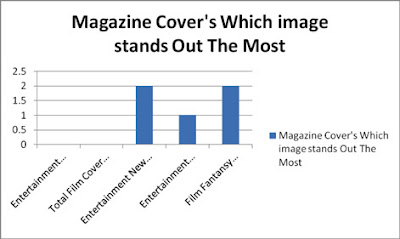
Finally the girls said that the magazine cover they liked the most was the Entertainment Weekly cover which featured two characters from New Moon (part of the twilight saga)

Market Analysis and Research Male's


we took a group of 5 males and did a questionnaire/group interview with them we showed them trailers film posters and film on the covers of magazines. This is what we found.out of the five males aged 15 two liked the trailer for the new Harry Potter (Fantasy) two like the trailer for Killers (Romcom) and one liked the trailer for The Lovely Bones (Horror)
We then shoed the film posters for Killers, Eclipse and The Proposal and asked then which colour's stood out the most and we found that the males were attracted to the red in the images.
the said the image/poster they liked the most was the killers because it had guns in it and they like the central image.
Then we moved onto magazine covers and they said that they liked the total film magazine cover the most which had a picture of Megan Fox in Jennifer's body.
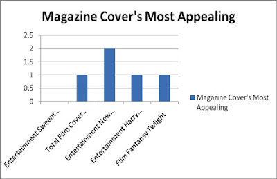
Again we asked them what colour's stood out the most on the magazine covers and as the graph shows they were in favor for the blues and greens.
we asked them what cover they liked the most and they said the Total Film cover (Megan Fox) and Entertainment weekly because of the big bold image of Jonhhy Depp.

Wednesday, 25 August 2010

Questionaire

This is the questionaire i made for my group to use to do our audience reasearch

Media Questionnaire

Name;
Age;
Gender:
Favourite Film;
Cinema Attendance; Less than once every once a
Once a month two weeks week

Magazine Cover’s

Which central image is most appealing to you?


Which colours stand out the most to you?


Which covers has the best font and readability?


Which magazine would you buy or do buy?


Which magazine cover is your personal preference?

Poster’s

What is the film that is most appealing to you?


What attracts you to this poster?


Where have you seen these poster’s?


Have you ever bought a film poster?


What colours stand out the most to you?


Do you recall any taglines from any film posters?


What image is the most appealing to you?

Trailer’s

Film;
Response;


Would that make you want and go and see the film?


What genre is the film?


When is the film released?


Have you seen a good trailer that has stuck in your mind? What was it?

Tuesday, 17 August 2010

The Proposal, Romantic Comedy 3rd Campaign

The magazine cover for The Proposal is very much for the female audience that the romantic comedies attract. There is only a small bit about the film in a short plug. The cover is very simple with just that one main image which the magazine are relying on to make people read on/ buy the magazine.

The poster is very simple and effective the white background with the black and red writing also the black costume that the actor’s are wearing is really contrasting with the white background. The poster tell use a lot it shows that Sandra Bullocks character is very dominating and powerful. We can see this from the uneasy look on Ryan Reynolds face we get the feeling he is backed into the corner also she is presenting the ring to him not the other way round. She looks very business like about it as well. We can tell it’s a comedy from the plug ‘HERE COMES THE BRIDE’ and her presenting the ring, the very fact she has a ring tells use it’s a romance as well.


The trailer sets the scene for the movie we see that the locations central New York in a highflying business. The way that the trailer presents the information to the audience in a chat instant message format displays further the business feel. The trailer has funny bits in it with and adult sense of humour so it shows the target audience for young adults also by having them getting married and kissing it show it is a romance as well as a comedy.

Juno, Teen Comedy 2nd Campaign


The magazine cover is very simple not a lot of colour just the Juno orange in the title of the movie and the Juno orange scarf that Ellen Page is wearing. The Juno orange crates the brand. The central image of Ellen Page shows that the target audience is teenagers, the bottom half of the image has an innocents and immaturity about it with the dirty converse and the untied laces. Then the top half of the image show a mature young lady, this relates to how see changes during the film and show that see has been forced to grow up fast, so fast that her feet are still trying to catch up.


The poster is eye catching a the orange and white colour scheme strengthens the Juno Brand just like the font by using the same font and colours it is recognisable throughout the advertising campaign. The image shows a pregnant teen and a geeky looking boy. This is hitting its target audience of teens and telling use part of the film.


The trailer light the posters sticks to the strong and dominating colour scheme of the orange and white, its powerful and eye catching. They really show they understand there target audience of teenagers because they cover all of there teen problems in the trailer, the feeling of being isolated, love, sex, school and social politics of being a teenager and they take it one step further by making you see it from the eyes of the one everyone stairs at.

Monday, 16 August 2010

Knocked Up, Comedy 1st Campaign


The magazine cover looks quite rude with the plug ‘Angmoh Lian + Fat dude = The Rudest Movie of the year, Knocked Up’ is aimed at the higher end of there target audience. The image is targeting men with Angmoh Lian on the chair with her high heels on showing alto of leg and with a very suggestible look on her face.


The poster is very basic and effective again using the same colour scheme of red for the title contributes to the creation of the brand. The plug of ‘WHAT IF THIS GUY GOT YOU PREGNANT?” shows that the film is going to be a comedy its funny you can laugh at it you can see that the film is meant to be funny and laughed at you can tell from the central image that he doesn’t take him self seriously his cheeky little smile, unshaven with mess hair and a creased t-shirt shows his a bit of a ‘bum’.


The Knocked Up Trailer shows the progression of the story and of the two lives in the film it gives you big emotions, happy to serious to sad to eventually a happy ending. The trailer uses the colour scheme of red text on a white background throughout the trailer to feed information to the audience. They have used red and white because the red stands out from the white background and it is eye catching.

Tuesday, 20 July 2010

1st Team Meeting


Team Members Present; Marcus Cameron
Kevin Ward
Abbie Pittaway
Danielle Wilson


Items Discussed;
In our first meeting we discussed what genre we wanted our teaser trailer, poster and magazine cover to be. we decided that we wanted it to be a Romantic Comedy. Also in our meeting we discussed what our target would be and we said it would be teens but we needed to more in depth research into this. Finally we look at what jobs each person in the team would do, we came out that i would do all the music and sound, Danielle on camera, Abbie Director and Kevin Assistant Director.

Friday, 2 July 2010

The magazine cover follows the theme of fantasy with the Avatar’s on the front from the body language of the Avatar’s we can see that the male is protecting the female and that the female looks almost threatened by what ever they are looking at out of shot. The magazine has kept to their standard layout with the masthead at the top in a contrasting colour. They also have put the plug in a different colour from the magazine background colour so that its is eye catching.


AVATAR: Movie Trailer. Watch more top selected videos about: Michelle Rodriguez, Zoe Saldana