This is the questionaire i made for my group to use to do our audience reasearch
Media Questionnaire
Name;
Age;
Gender:
Favourite Film;
Cinema Attendance; Less than once every once a
Once a month two weeks week
Magazine Cover’s
Which central image is most appealing to you?
Which colours stand out the most to you?
Which covers has the best font and readability?
Which magazine would you buy or do buy?
Which magazine cover is your personal preference?
Poster’s
What is the film that is most appealing to you?
What attracts you to this poster?
Where have you seen these poster’s?
Have you ever bought a film poster?
What colours stand out the most to you?
Do you recall any taglines from any film posters?
What image is the most appealing to you?
Trailer’s
Film;
Response;
Would that make you want and go and see the film?
What genre is the film?
When is the film released?
Have you seen a good trailer that has stuck in your mind? What was it?
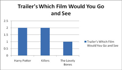 The Girls again like the Harry Potter trailer and The Killers trailer.
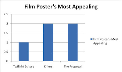 The girls found the Killers (romcom) and The Proposal (romcom) the most appealing film posters.
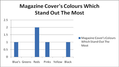 With magazine covers they said that red was the colour that stood out the most in the magazine covers but also they said the blue's, pinks and blacks stood out because they were the contrasting colours to the background
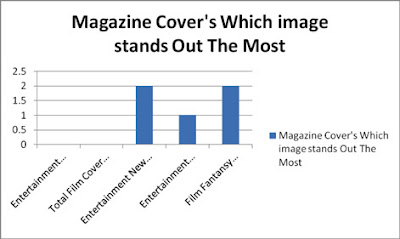 The girls like the Twilight saga posters and the Harry Potter posters the most.
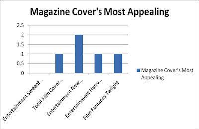 Finally the girls said that the magazine cover they liked the most was the Entertainment Weekly cover which featured two characters from New Moon (part of the twilight saga)


.jpg)

